Difference between ‘Vector’ shape & ‘Pixel’ shape.
Vector shapes are used on apps like Adobe Illustrator and Pixel shapes are used apps like Adobe Photoshop. An easy definition for this is Pixel shapes do not seem as detailed as the vector shapes because the will seem pixelated, this means that if you zoom in closer you can see little squares which does not make the shape look as smooth as the vector shape.
What is Adobe Illustrator?
Adobe Illustrator is graphic-driven software used mainly for creating vector graphics. Developed alongside with Adobe Photoshop, Adobe illustrator is used for creating logos, graphics, cartoons and fonts for the photo layouts of Adobe Photoshop.

Shape Builder Tool- For this I used the rectangle and eclipse tool, I then placed them so they would attach. Next, I used the selection tool to highlight bot of the shapes and finally I used the shape builder tool by drawing a line connecting them into one shape.

Live paint bucket- First I highlighted the shape has a whole, clicked on live paint bucket tool and has seen I used 3 colours, I also switched the colours using the arrow keys.

Layer Trace- First I got an image from google and used the Tracing menu and used 8 colours giving the image a artistic look.

Pen Tool- First I went on Beth’s WordPress to get this work sheet. The simplest path you can draw with the Pen tool is a straight line, made by clicking the Pen tool to create two anchor points. The second line was a bit trickier because I had to draw the line my self.
Colour psychology
What is Colour Psychology?
Colour Psychology is when colours impact moods, feelings, and behaviours. colours have also been associated with increase blood pressure, increase metabolism and eyestrain. There colours that make you feel many emotions like happy, sad, angry, etc. Here are a few examples of Colour Psychology…
:max_bytes(150000):strip_icc():format(webp)/2795824-color-psychology-5b0478de04d1cf003aac1625.png)
Colour Psychology is used in most houses to make you feel calm, focus, excitement, etc. Colour Psychology is a big thing for business. This is used mainly on the the logo of the company to promote their brand.
colour psychology in marketing
This logo has multiple colours and they do suit the company, the colour green makes you feel heathy, the white makes you feel calm and the final colour yellow makes you feel happy or warmth. I think Subway used these colours because they are giving a message to make the buyer know that their product is fresh, healthy and that could make you feel happier.
The McDonald’s logo has been changed to green but most people today always think of the logo as red. The reason is because it was for a long time but also the colour red is used for a lot of food related companies like KFC, Nando’s, Pizza Hut, etc. This is because it revs up people’s appetites, making them hungry, which therefore makes them more likely to enter the store and then buy food. And the yellow bring a happy and warmth feeling.
This logo has one main colour Orange, and this colour makes you feel cheerful and friendly. And this colour suits this logo because this company is for children.

This is the start of the the poster. My item was a buckle and I know the character Flash has a cool belt buckle. The red and yellow colour are the colours flash’s logo. When I finish this poster I will be adding the flash logo to make it eye-catching and I will have a photo of someone running to show off the product.
Level 2 Audience
Primary Audience- Primary audiences are those who receive the communication directly and are also known as the target audience. For example, if I was have to present the topic of Pepper Pig this would be for the younger audience.
Secondary Audience- Secondary audiences are those who not likely to buy a product but could be persuaded for the primary audience. There are toy companies like smith who bring out adverts that is aimed at children but for parents to buy the products.
Group Audience- This is where you and a group of others are when people consume media products together, so that could be like going to the cinema, playing games online, listen to music, etc.
Individual Audience- Similar to group audience but its on your own, this is also were you consume media products like videos, podcasts, audio books, etc. This can be done by using head phones. And instead of online games you could be on a single player game which doesn’t require others.
Good & Bad adverts
Here are two adverts that have been banned or received critical feedback.
Fonts
What is Typography?– Typography is technique of arranging type to make written language readable and appealing when displayed. This means that the writing has to be centre of the page and space between letters are adjusted.

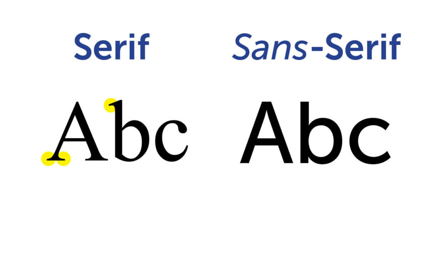
Serif vs Sans-Serif-Identifying the difference between them is very simple. Serif fonts have that extra stroke or decorative design on the end of letters, where as Sans-Serif doesn’t have any such design or stroke.
What is Kerning?– In typology kerning means adjusting the spacing between characters in a font.

What is Leading?-Leading is a typography term that describes the distance between each line of text.

Burger king

History of Burger King


Advertising Poster, Must use the tagline “BECAUSE FIRE IS BETTER”.
The audience is for 18-24 who don’t watch tv and don’t go to BK.
Good Examples

I like This design because it is very eye-catching because of the red background, the colour red also revs up appetite which is smart for a company like BK. The white writing is easy to read as its big, bold and the background goes well for the writing.

I like this poster because it looks simple yet mysterious, the black background with the white text goes well as it is also eye-catching. The writing is also to read as it stands out in this poster. The only thing I would change is the bottom of the poster, the font is kind of blending in the picture because the colours are similar.
Bad Examples
I don’t like this poster because this will make people feel more frighted than intrigued to eat here, it also looks like BK are promoting a horror movie than the actual restaurant. Also the sentence “Come As A Clown” just sounds insulting. I think this poster was aimed at McDonalds as they have a history of clashing with them in adverts.
This design looks poor and the background should have been different. The font is bland and it is hard to read the writing that is poster. There is nothing that I like on this poster, the sentence “keep calm and burger king” doesn’t even make any sense.
I would like to use the first poster for inspiration on my poster cause i think it smart and eye-catching to use the colour red for the background because in colour psychology red is best for food companies to build up an appetite. I will use a Burger King logo to show that the poster is about the restaurant, I will also use white text which suits the red background as it is easy to read.

Again I like the black background and white writing as it is very easy to read. I like the photo of the burger and flame coming out of the grill because it is very appetising to look at. The only thing i would change would be the fact it has so much writing because it is hard to read.

This is an old poster for Burger King, it is very nice but a bit bland compare to the posters made now. The poster is colourful but i think they could have chosen better combinations of colours.
Burger king vs mcdonalds!!
Burger King and McDonalds have been battling in the food industry for so long that they they have adverts mentioning the other company, they have also worked together to bring awareness for charity.

I like this advert because it is funny and awesome to look at from the colours, font and the fact it mentions Ronald McDonald is brilliant.
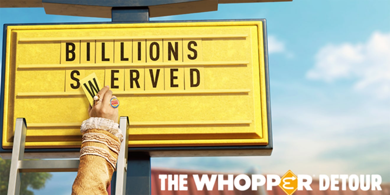
Here’s another one of BK poking fun at McDonalds by calling it “The WHOPPER Detour” with the McDonalds logo in the title. I also like the concept of the Burger King changing the sign.

This is where they called it truce to spread awareness for cancer that McDonalds began, so to help BK began an event called “A Day Without Whopper” and they donated their guests to McDonald’s charity.


Out of the ones above I like the font saying flame as it is bold and the top of the text is burning which looks awesome.
My Sketches


Here are two design ideas for the poster that I will create, I want have a cool and mysterious poster as the background will be black, the font will be red and white, and i want the BK mascot to be in the poster. The design I prefer is the first one because I like the fact he can summon whoppers to float around is head.
Final Design

This is the final look on the Burger King Poster, I saved it three times as a jpeg, psd and png. I am happy with the poster but in my sketch I thought it would look better. If I could change the poster I would make the BK mascot maybe raise is arms to make it look like he is doing some magic with the floating burgers on fire. The things I like about the poster is the font, I had to download and install the font onto the photoshop. I did change the colour of the text as I was planned to have it white but with the flame font I don’t think that would go as well as the colours I picked, the two colours I picked on the text was red and orange because it goes well with the title. Overall I am happy with my final design.
